Our logo
Our logo is a symbol for what we stand for. There are two variations that can be used. Ensure the following guidelines are observed when using the logo.
Our logo
Our logo is based on momentum, a pure symbol for what we stand for. There are two variations that can be used. A wordmark that shows our full name, and our motif (the M icon on it’s own).
Primary Logo
This is our primary logo. It can be used on any communication to brand it. Its important to ensure it’s used in the correct colour paring.
Primary Logo
This is our primary logo. It can be used on any communication to brand it. Its important to ensure it’s used in the correct colour paring.
Primary Logo
This is our primary logo. It can be used on any communication to brand it. Its important to ensure it’s used in the correct colour paring.
Primary logo - white
Primary logo - white

Primary logo - Black
Primary logo - Black
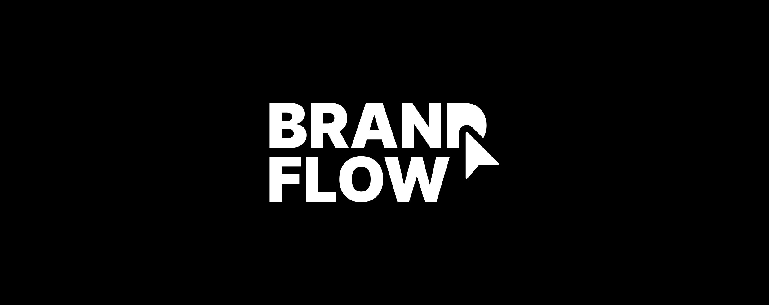
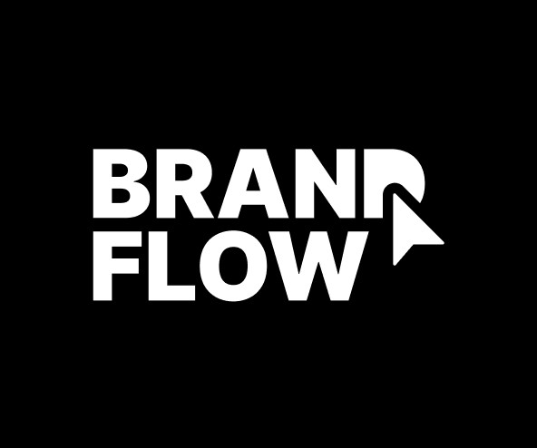
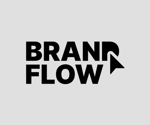
Secondary Logo
This is our secondary horizontal logo. It can be used when vertical space is limited.
Secondary Logo
This is our secondary horizontal logo. It can be used when vertical space is limited.
Secondary Logo
This is our secondary horizontal logo. It can be used when vertical space is limited.
Secondary logo - White
Secondary logo - White

Secondary logo - Black
Secondary logo - Black
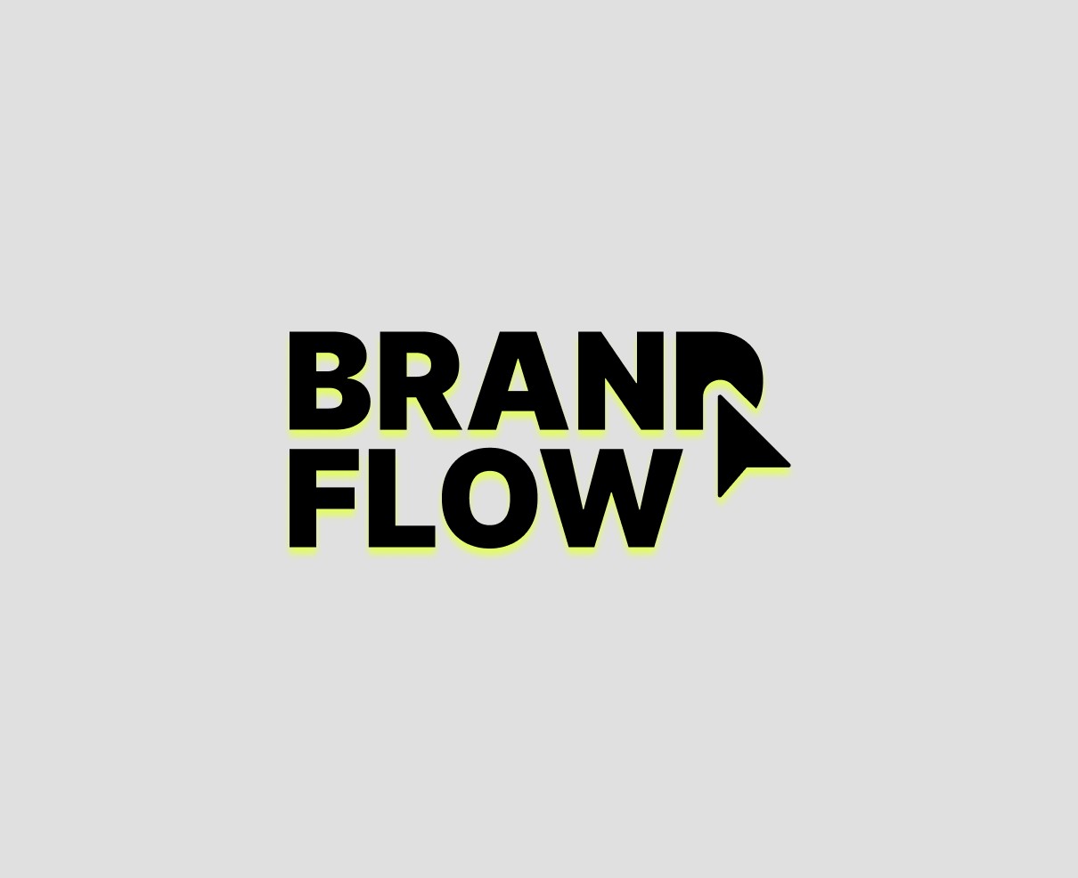
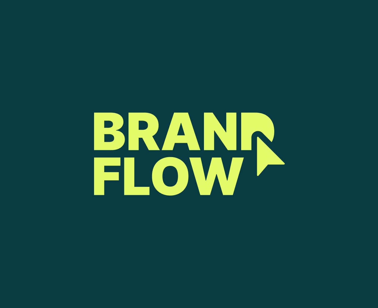
Color pairing
For consistency it’s important to make sure we use the logo in the correct colors. The below color pairings apply to both the primary and secondary logo use.
Color pairing
For consistency it’s important to make sure we use the logo in the correct colors. The below color pairings apply to both the primary and secondary logo use.
Color pairing
For consistency it’s important to make sure we use the logo in the correct colors. The below color pairings apply to both the primary and secondary logo use.
White logo on black background
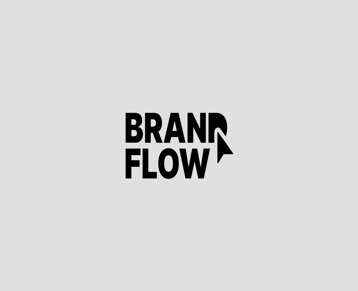
Black logo on grey background
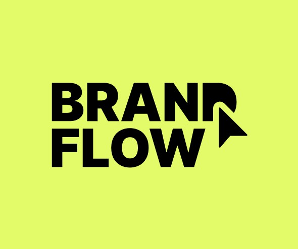
Black logo on lime background
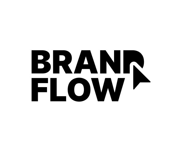
Black logo on white background
Does and don'ts
The logo is our main brand mark so we need to protect it. Always try to ensure it is used correctly and not misused.
Does and don'ts
The logo is our main brand mark so we need to protect it. Always try to ensure it is used correctly and not misused.
Does and don'ts
The logo is our main brand mark so we need to protect it. Always try to ensure it is used correctly and not misused.
Don't alter the logo
Don't stretch or squash the logo
Don't add effects
Don't use the logo as a keyline

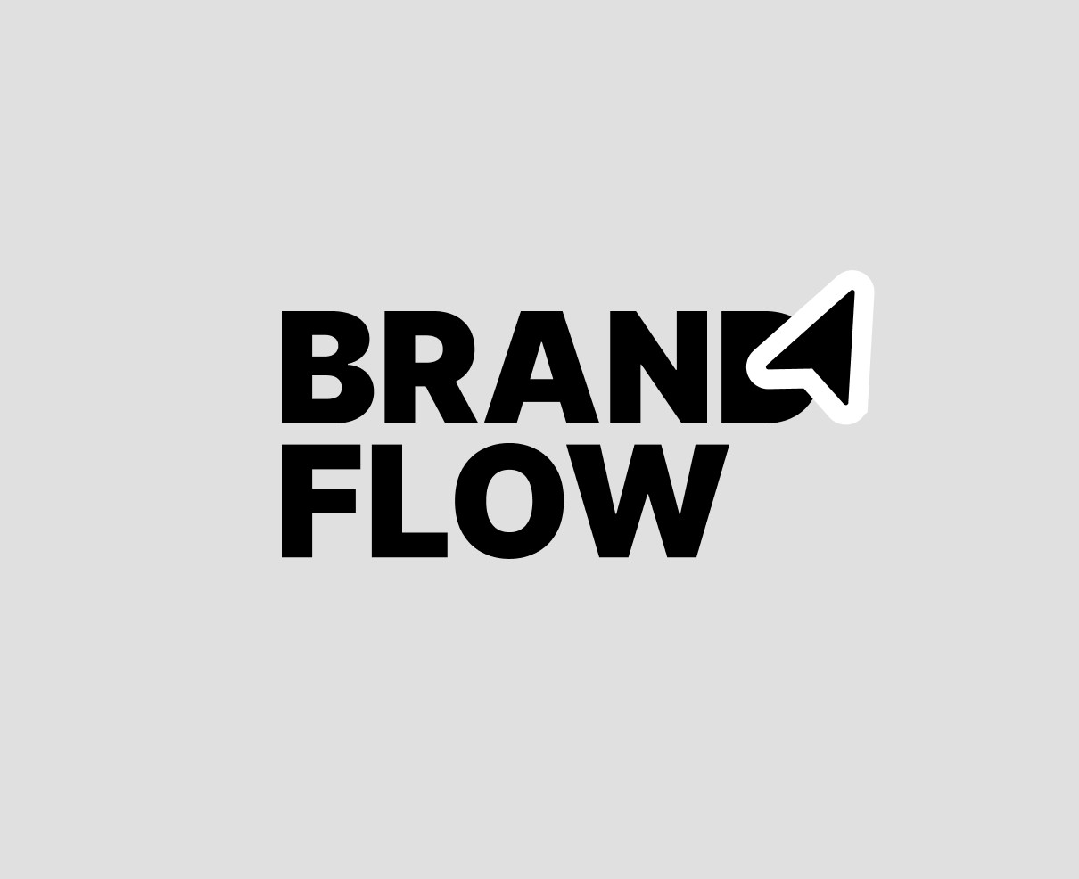
Ensure good contrast
Make use of the full color palette